The Quiet Power of Colour: Planning Your Home With Subtle Hues, Zoning and Flow
30 March 2026
Singapore
Share

There is a common misconception in home renovation: that colour is a finishing decision. Something chosen after the layout is settled, the carpentry drawn, the materials committed to.
But the most beautifully resolved homes — the ones that feel effortless the moment you step inside — were never designed that way.
Colour was never an afterthought. It was part of the conversation from the very beginning.
At Loren Ng Designs, we treat colour as part of the spatial language of a home, considered alongside layout, carpentry, and material from the very first planning conversation. Because when colour is understood early, it does not merely decorate. It defines how a home flows, how each zone is experienced, and how you feel the moment you walk through the door.
When Colour Gets Asked to Do Too Much
In our experience working with homeowners, paint-related anxiety rarely begins with paint. It begins earlier — when a home has not yet been truly understood in terms of how it should flow, where one zone should ease into another, and what each space is genuinely meant to hold.
Research in environmental psychology consistently shows that spatial clarity directly influences emotional comfort. When we cannot intuitively read a space — when the entry offers no arrival, when living and dining blur without intention — we experience it as vague, even mildly stressful, without knowing why.
Colour is then brought in to rescue what was never properly planned. And that is where disappointment almost always begins.
Because colour is not merely decorative. Used with intelligence, it organises, softens, and helps a home read with far greater grace.
A Well-Designed Home Never Feels Accidental
The most refined homes rarely rely on dramatic contrast or obvious statements. What they possess, instead, is quiet legibility.
You understand where to arrive. Where to gather. Where to focus. Where to retreat. Your body registers all of this before your mind catches up — and that is precisely the point.
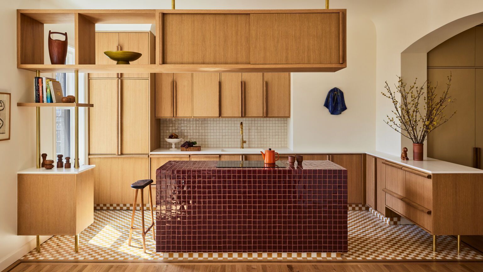
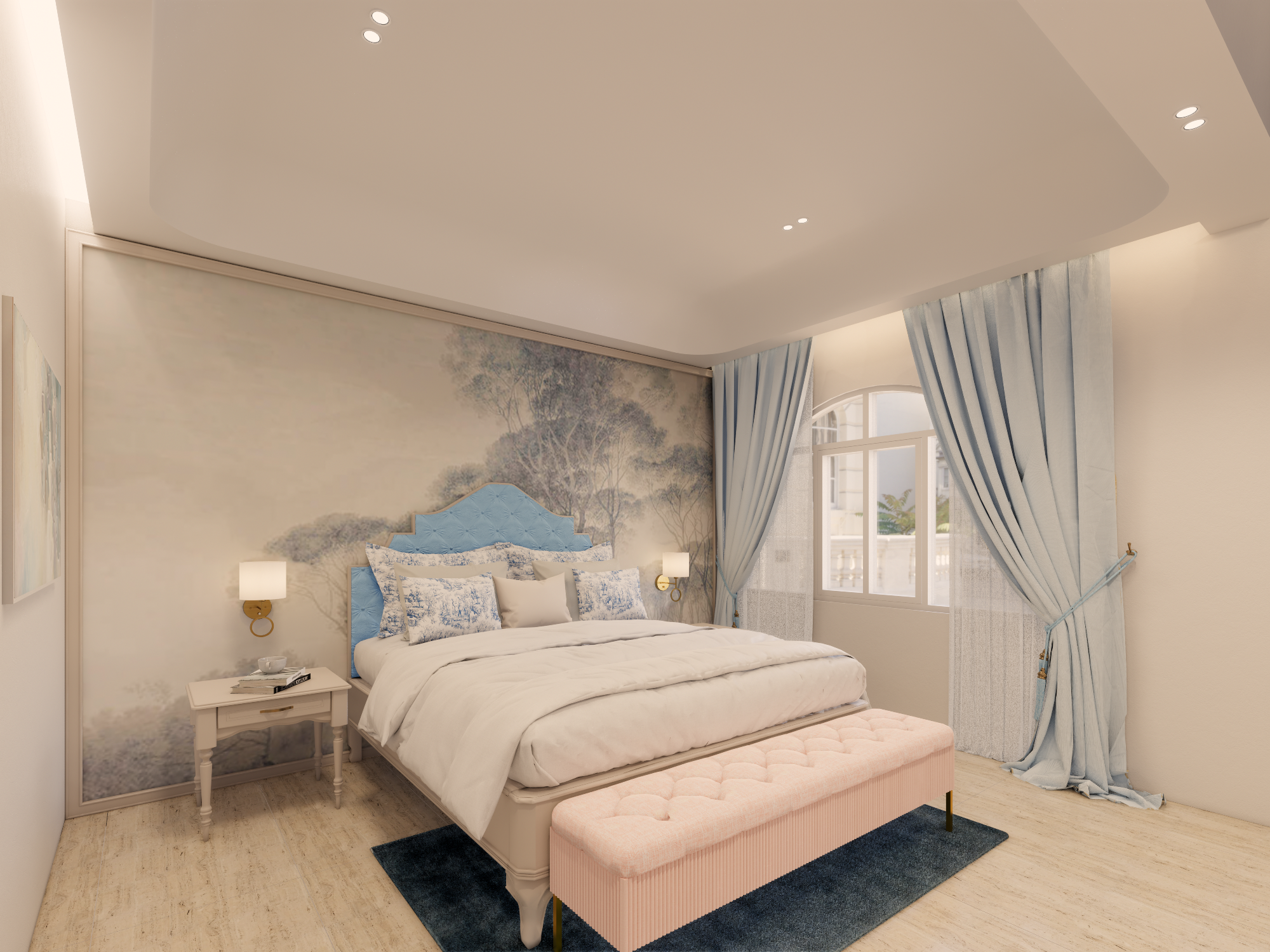
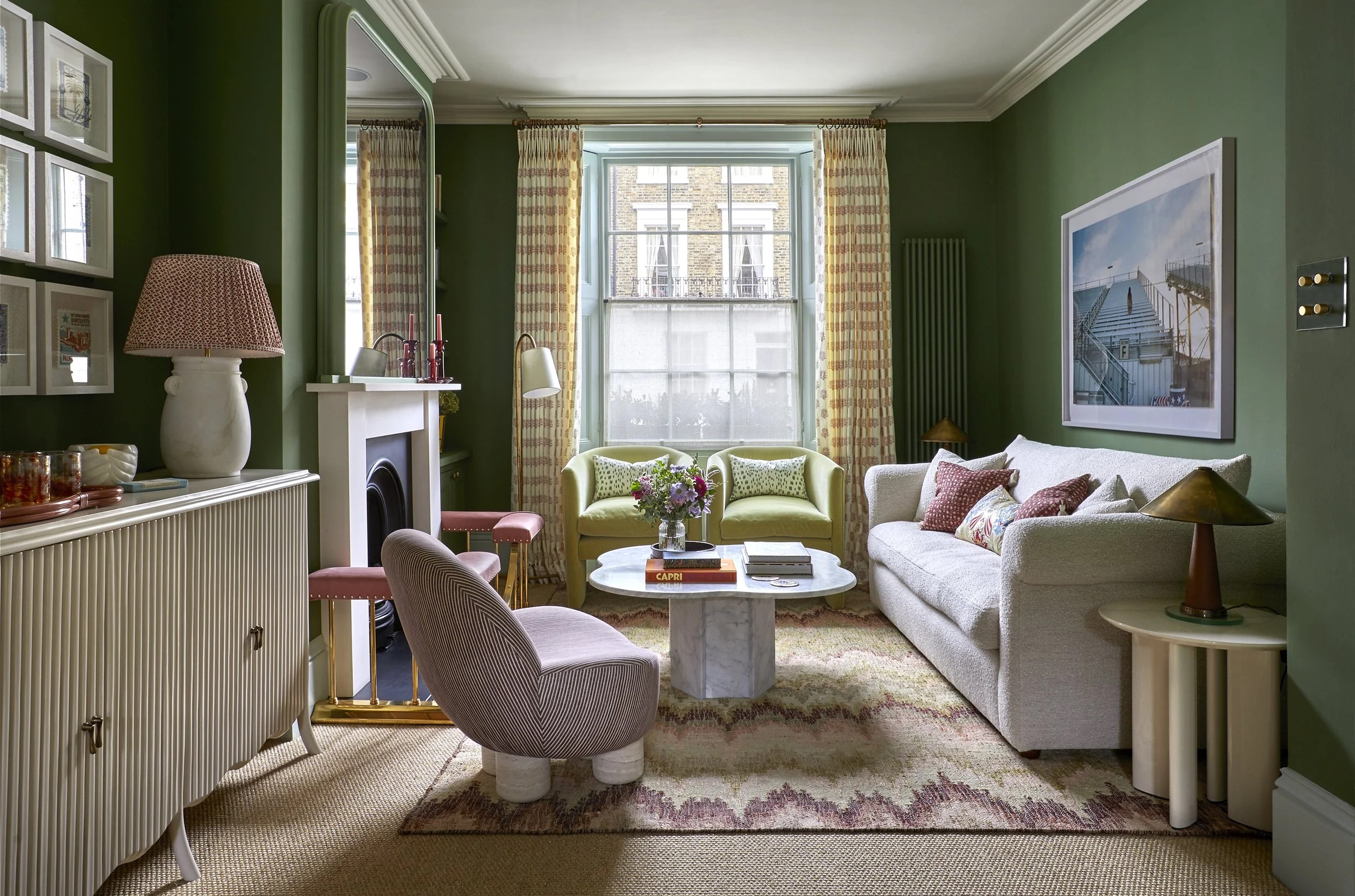
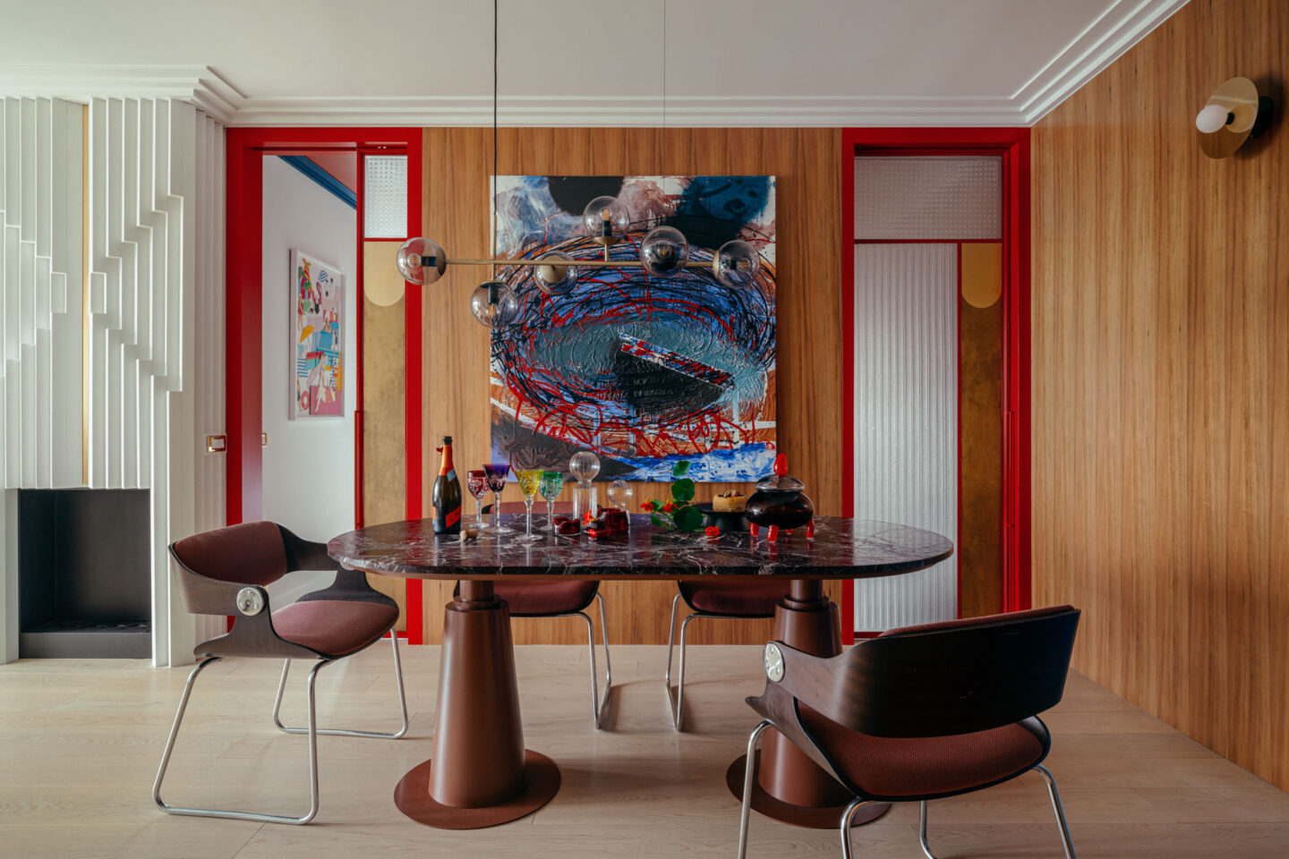
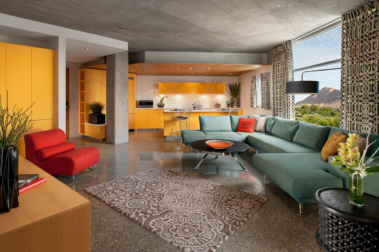
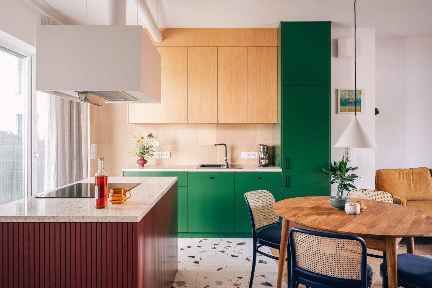
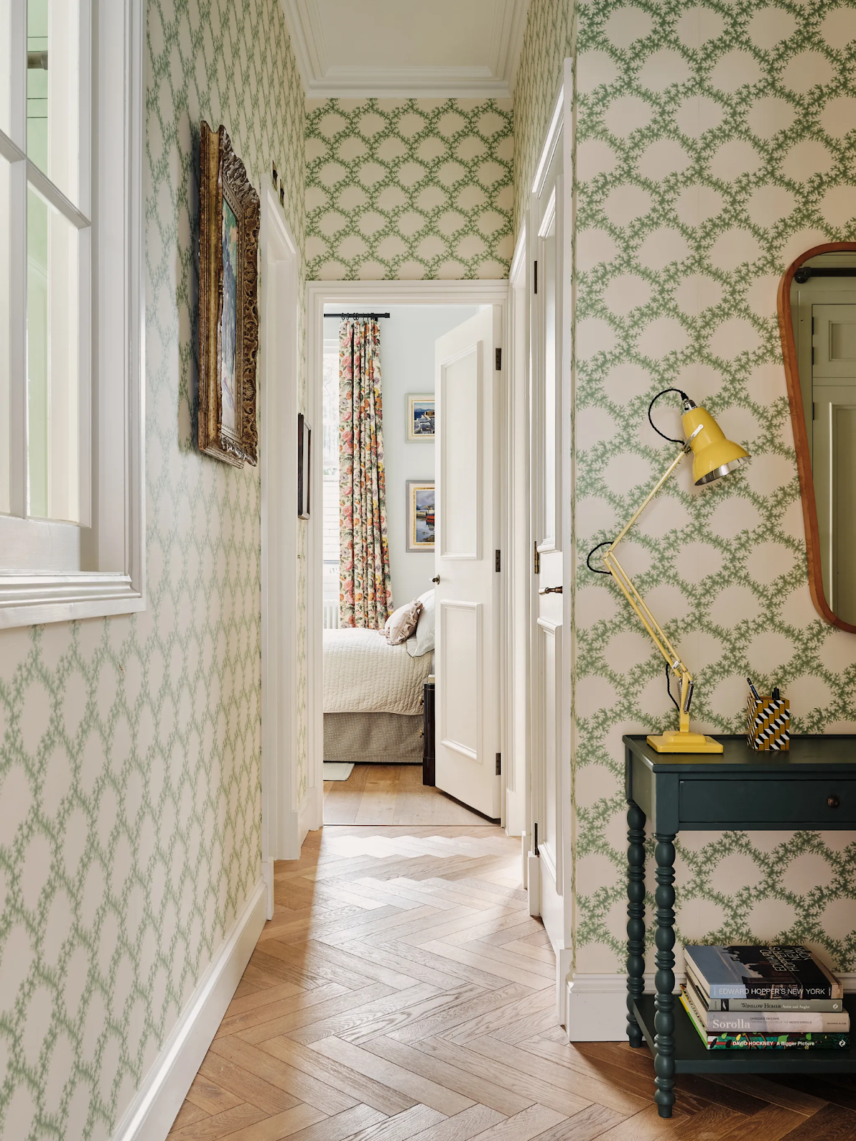
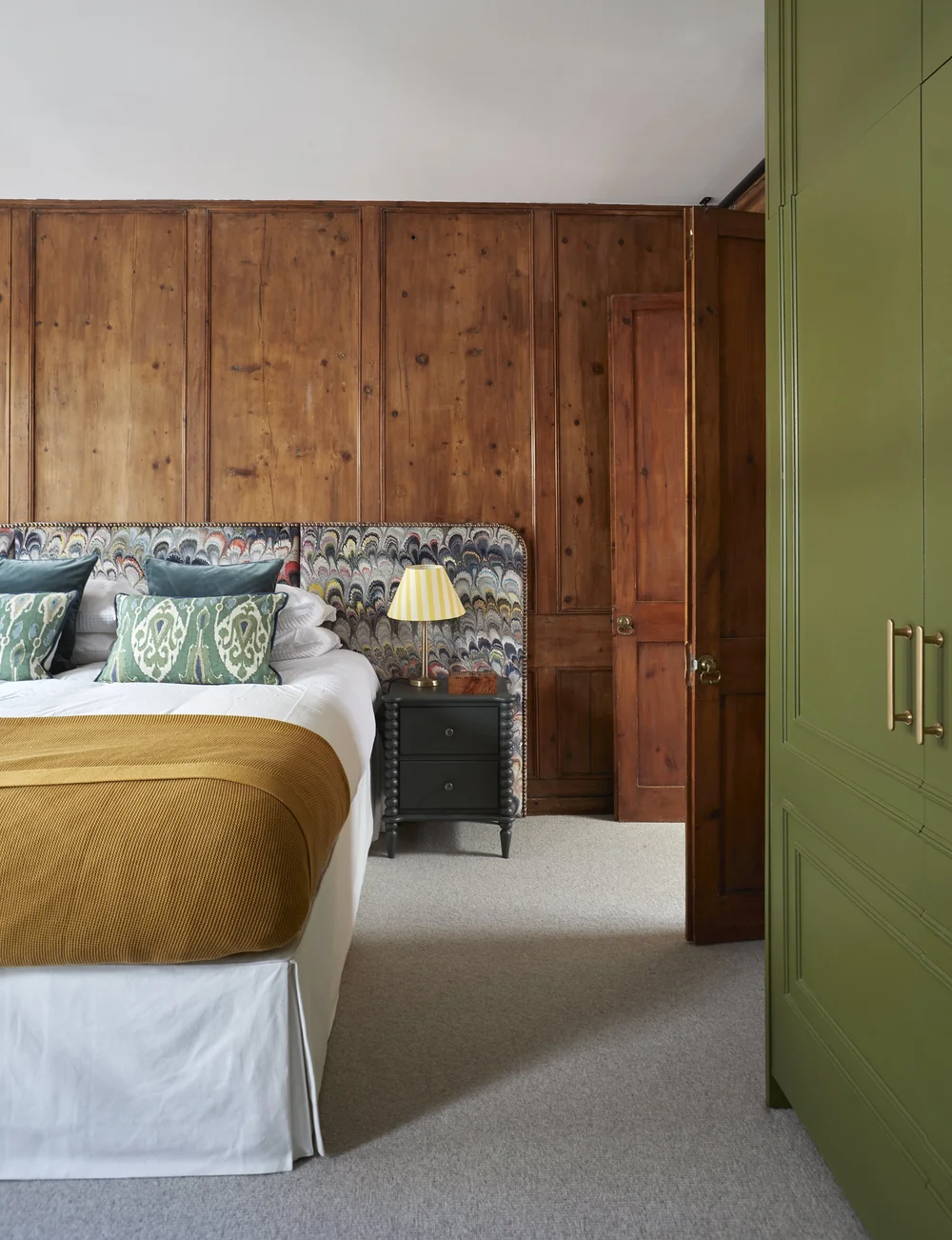
Colour is one of the most powerful tools available to create this kind of spatial intelligence. A softer tone eases you into a private zone. A deeper hue grounds a dining area with psychological weight. A tonal shift gives an entry a sense of arrival without visually severing it from the rest of the home. A continuous palette allows open-plan living to feel fluid rather than visually loose.
This is the kind of subtlety that changes how a home is experienced, not merely how it looks on a mood board.
Think in Zones, Not Just Rooms
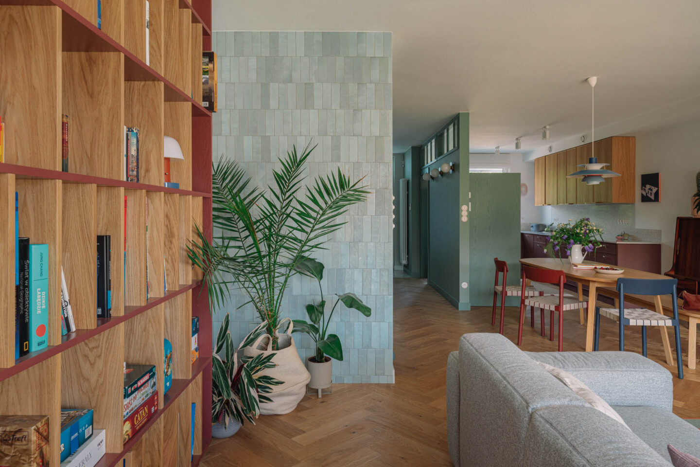
A home is not a collection of rooms. It is a sequence of experiences — the arrival zone, the social zone, the working zone, the private zone — with meaningful transitions in between.
Each zone should feel slightly different. Not dramatically so, but legible. Colour is what creates that legibility.
An entry benefits from a hue that feels slightly more cocooning than the main living area — something that signals: you have arrived, this is yours. A corridor carries the home's rhythm, connecting without interrupting. A reading corner or study nook settles more comfortably into a slightly deeper shade that grants it psychological definition without visually cutting it off from the room.
Before selecting any paint, it is worth asking: What is this part of the home meant to hold? Should it feel open, grounded, intimate, or transitional? What should the eye notice first — and what should simply support the whole? These questions consistently yield more meaningful colour decisions than trend boards or Instagram saves ever will.
The Most Sophisticated Palettes Rarely Shout
When homeowners first hear "colour zoning," they often imagine bold contrast or deliberate colour blocking. But in the most refined interiors, the effect is far more restrained.
A beautifully resolved palette does not announce every move it makes.
Sometimes the difference between two adjoining spaces is nothing more than a soft tonal shift — a change in depth, or a subtle variation within the same undertone family. Just enough to create hierarchy. Just enough to guide the eye. Just enough to make the home feel composed rather than arbitrary.
The most enduring colour stories are built on relationship, not variety: one anchoring neutral, one or two supporting tones, a deeper note for emphasis, a lighter one for breath. The result is not sameness — it is continuity with intelligence.
Flow Lives in the In-Between
What makes a home feel elegant is not only how each room presents itself individually. It is how one space leads into the next.
If every area is treated as a separate visual event, the interior fragments. If everything is identical, it reads as flat. Good flow sits between those extremes — allowing distinction without disconnection, contrast without chaos.
Colour, when considered early and with intention, is one of the gentlest and most effective ways to achieve that balance. It is especially powerful in entries, open-plan living and dining areas, study corners, corridors, and in the treatment of joinery and built-ins — anywhere a subtle tonal shift can do the quiet work of defining and connecting.
Colour Must Be Read Alongside Light and Material
A colour is never experienced in isolation. It is shaped by the quality of light, by flooring, by cabinetry, by stone, by fabric, by the shift from morning to dusk.
This is why choosing paint from a swatch — or worse, from a single reference image — so often disappoints. A shade that reads as warm and elegant in one home may turn cool and flat in another. The question is never simply do I like this colour? What does this colour become in this room, with these finishes, under this light?
That is when colour selection moves from personal preference into genuine design judgment.
At Loren Ng Designs, we bring colour into the planning conversation early — not as decoration, but as spatial language. Because when colour is considered alongside carpentry, layout, and material, it does something far more meaningful than simply beautify a room.
It defines. It guides. It connects. And in a home designed with real intention, that quiet guidance is often what creates the deepest sense of ease.
If this resonates with you, you might love this next read: The Feel of Colour: How Hue and Finish Shape Your Home’s Emotions, a deeper dive into the psychology behind every shade you choose.
If you are planning a renovation and want your home to feel as good as it looks, we would love to help you shape it with greater clarity and intention.
Contact us to begin your design journey.
📩 ask@lorenngdesigns.com
📷 @loren_ng_designs
Posted by:

BACK TO BLOG
You Might Also Like